![logo-green.png]](https://www.help.archer.re/hs-fs/hubfs/logo-green.png?height=40&name=logo-green.png)
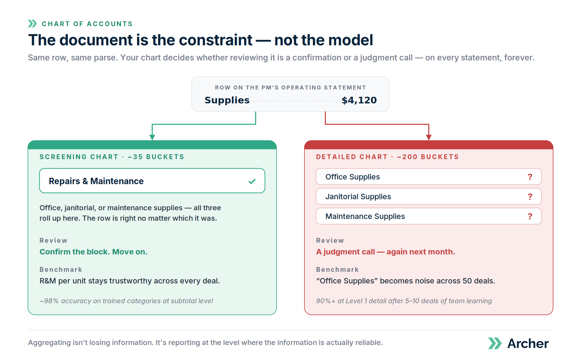
Archer's mapping is accurate: roughly 98% on trained categories at subtotal level, and 90%+ at Level 1 detail after five to ten deals of team-specific learning. But accuracy isn't a fixed number. It depends on a variable most people never name — how many ways a given row could legitimately be coded.
Precision isn't accuracy
Precision is how finely you slice. Accuracy is whether the slice is right. A 200-bucket chart is more precise than a 35-bucket chart — and, past the point the source document supports, less accurate. The extra precision produces numbers that look authoritative and are simply wrong.
Real estate finance people already know this in another form: a five-decimal exit cap isn't a better exit cap.
The document is the constraint
Take a row that reads "Supplies — $4,120." It genuinely could be office supplies, janitorial supplies, or maintenance supplies. No model recovers that from eight characters, and neither can the sharpest analyst on your team.
- If all three roll up into Repairs & Maintenance on your chart, the row is right no matter which it was. You confirm it and move on.
- If you've turned on separate buckets for all three, someone has to open that row and decide — and decide again next month, because next month's statement still just says "Supplies."
We're not hitting the limit of the model. We're hitting the limit of the document.
What this does to your benchmarks
This part is counterintuitive, and it matters most to the teams who wanted granularity in the first place.
If ambiguous rows land in Office Supplies half the time and Janitorial the other half, the R&M total stays correct — but the Office Supplies benchmark is now noise. Fifty deals in, the granular benchmarks you built the chart for are the least trustworthy numbers in your dataset.
It compounds. Mapping corrections are team-specific. If two analysts code the same ambiguous row differently on different deals, they're teaching the system a contradiction. Granular charts don't just learn slower — they can plateau lower.
Aggregating isn't losing information. It's reporting at the level where the information is actually reliable.
What to do with this
- Screen at the level your decisions need; go granular when a deal earns it → Choosing your COA strategy
- Decide splits one line at a time → The Turn-It-On Test
- If you want granular budget comparison, use the Budget tab instead of a granular model → Upload a Year 1 budget
- If your team is already on a very granular chart and review feels slow, email support@archer.re. We can build a screening chart alongside your detailed one — nothing gets deleted — and you can time both on your next five deals.